Color schemes that appeal to potential buyers
Colour psychology is the study of how various colours can influence human behaviour, emotions, and perceptions. It is a potent tool utilised to establish specific moods or atmospheres within spaces. Different colours can elicit diverse emotional responses and significantly impact one’s mental and emotional state.
For instance, warm hues such as red, orange, and yellow are recognised as stimulating and energising, whilst cool tones like blue, green, and purple are considered calming and soothing. Comprehending the psychology of colour is crucial when selecting a colour scheme for one’s home, as it can affect how occupants and visitors feel in each room. Moreover, the psychology of colour can influence how potential buyers perceive a property.
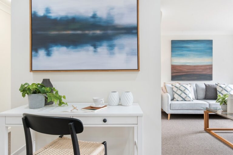
When preparing a home for sale, it is essential to consider the emotional impact of different colours on prospective buyers. For example, neutral shades such as white, beige, and grey are frequently employed in home staging because they create a sense of tranquillity and cleanliness, which can make a space more appealing to potential buyers. Conversely, bold and vibrant colours may be off-putting to some buyers, so it is advisable to use them judiciously and strategically.
Summary
- Colour can have a significant impact on our emotions and behaviour, making it an important consideration in home design and staging.
- When choosing a colour scheme for your home, consider the mood and atmosphere you want to create in each room.
- Popular colour schemes for different rooms include calming blues and greens for bedrooms, warm neutrals for living rooms, and vibrant hues for kitchens and dining areas.
- Using accent colours strategically can enhance the visual appeal of a space and draw attention to key features.
- Colour can play a crucial role in home staging, influencing potential buyers’ perceptions and creating a welcoming and inviting atmosphere.
Choosing the Right Colour Scheme
Neutral Background, Bold Accents
One popular approach is to use a neutral colour as a base and then add pops of colour through accessories and accent pieces. This allows for flexibility and makes it easier to update the look of a room without having to repaint the walls.
Considering Natural Light
Another important factor to consider when choosing a colour scheme is the natural light in each room. Natural light can have a significant impact on how colours appear in a space, so it’s essential to test paint samples in different areas of the room to see how they look in different lighting conditions.
Complementing Existing Elements
Additionally, it’s essential to consider the existing furniture and decor in each room when choosing a colour scheme, as you want the colours to complement the existing elements in the space.
Popular Colour Schemes for Different Rooms
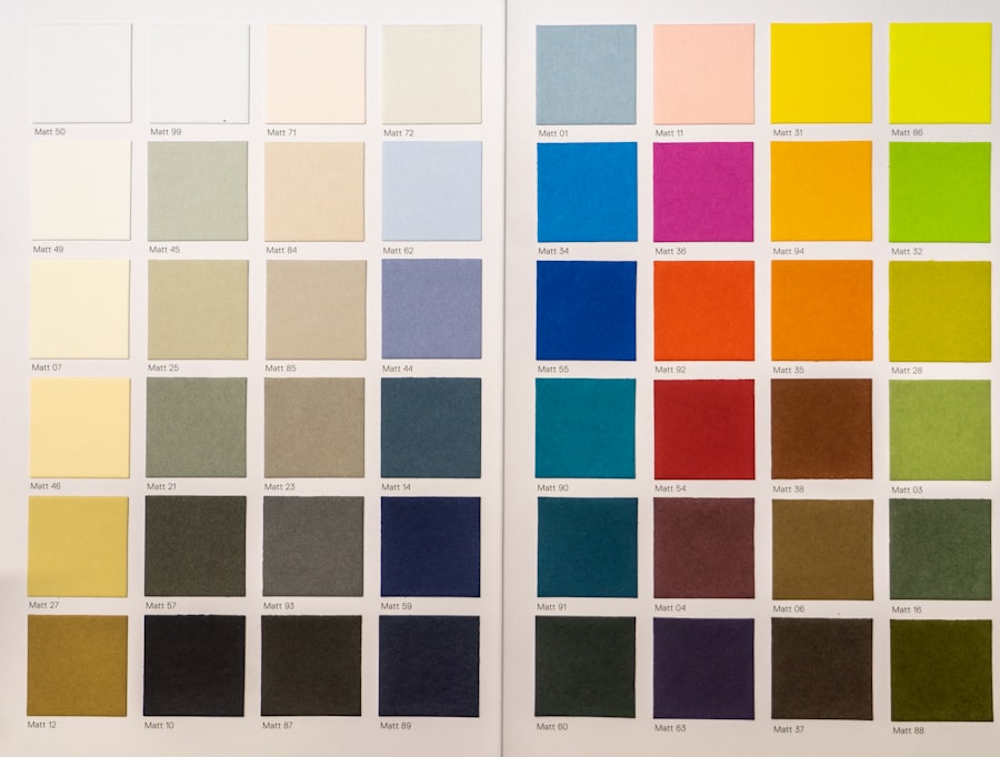
Different rooms in a home serve different purposes, so it’s important to choose a colour scheme that reflects the function of each space. For example, in the living room, you may want to create a warm and inviting atmosphere, so using warm neutral colours like beige or light brown can help achieve this. In the bedroom, you may want to create a calming and relaxing environment, so using cool colours like blue or green can help promote rest and relaxation.
In the kitchen, using bright and vibrant colours like yellow or red can create a lively and energetic atmosphere, while in the bathroom, using light and airy colours like white or light blue can create a sense of cleanliness and tranquillity. It’s important to consider the function of each room when choosing a colour scheme, as this will help create a cohesive look throughout your home.
Using Accent Colours to Enhance Appeal
Accent colours are an excellent way to add visual interest and personality to a space. They can be used to highlight architectural features, create focal points, or tie together different elements in a room. When using accent colours, it’s important to choose colours that complement the existing colour scheme and add visual interest without overwhelming the space.
One popular approach is to use a complementary colour as an accent. Complementary colours are opposite each other on the colour wheel and create a strong contrast when used together. For example, if you have a predominantly blue colour scheme in a room, adding accents of orange can create a striking visual impact.
Another approach is to use analogous colours as accents, which are next to each other on the colour wheel and create a harmonious and cohesive look. Using accent colours strategically can enhance the appeal of a space and create a dynamic and visually interesting environment.
The Impact of Colour on Home Staging
Colour plays a crucial role in home staging as it can influence how potential buyers perceive a property. When staging a home for sale, it’s important to create a neutral and inviting environment that appeals to a wide range of potential buyers. Neutral colours like white, beige, and grey are often used in home staging because they create a sense of calm and cleanliness, which can make a space feel more inviting to potential buyers.
In addition to using neutral colours, it’s also important to use accent colours strategically to add visual interest and personality to a space. Using accent colours in accessories like throw pillows, artwork, or rugs can help create focal points and draw attention to key features in a room. When staging a home for sale, it’s important to create a cohesive and visually appealing environment that allows potential buyers to envision themselves living in the space.
Colour Trends in Real Estate

Natural and Earthy Tones
In recent years, there has been a shift towards using more natural and earthy tones in interior design, reflecting a growing interest in sustainability and eco-friendly living. Neutral colours like beige, taupe, and olive green have become increasingly popular as they create a sense of warmth and comfort in a space.
Bold and Vibrant Accent Colours
Another trend in property is the use of bold and vibrant accent colours to add personality and visual interest to a space. Using bold colours like emerald green, deep navy, or mustard yellow as accent colours can create a striking visual impact and add character to a room.
Biophilic Design Principles
Additionally, there has been an increased interest in using biophilic design principles in property, which involves incorporating natural elements like plants and natural materials into interior design. This trend has led to an increased use of earthy tones and natural textures in interior design.
Tips for Implementing Colour Schemes to Attract Buyers
When implementing colour schemes to attract buyers, it’s important to create a neutral and inviting environment that appeals to a wide range of potential buyers. Using neutral colours like white, beige, and grey as a base can create a sense of calm and cleanliness that makes a space feel more inviting. Additionally, using accent colours strategically can add visual interest and personality to a space without overwhelming potential buyers.
It’s also important to consider the natural light in each room when implementing colour schemes. Natural light can have a significant impact on how colours appear in a space, so it’s important to test paint samples in different areas of the room to see how they look in different lighting conditions. Additionally, it’s important to consider the function of each room when implementing colour schemes, as this will help create a cohesive look throughout your home that appeals to potential buyers.
In conclusion, understanding the psychology of colour is essential when choosing a colour scheme for your home. Different colours can evoke different emotions and have a significant impact on our mental and emotional state. When choosing a colour scheme for your home, it’s important to consider the overall mood and atmosphere you want to create in each room.
Different rooms serve different purposes, so it’s important to choose a colour scheme that reflects the function of each space. Using accent colours strategically can enhance the appeal of a space and create a dynamic and visually interesting environment. In real estate, colour trends are constantly evolving, influenced by factors such as fashion, design trends, and cultural influences.
When implementing colour schemes to attract buyers, it’s important to create a neutral and inviting environment that appeals to a wide range of potential buyers.
FAQs
What are color schemes that appeal to potential buyers?
Color schemes that appeal to potential buyers are typically neutral and calming, such as shades of grey, beige, and white. These colors create a sense of space and allow potential buyers to envision their own style and furnishings in the property.
Why are neutral color schemes preferred by potential buyers?
Neutral color schemes are preferred by potential buyers because they create a blank canvas that allows them to imagine their own personal style and preferences in the space. Neutral colors also create a sense of calm and can make a space feel larger and more open.
Are there any specific colors that should be avoided when trying to appeal to potential buyers?
When trying to appeal to potential buyers, it’s best to avoid bold and bright colors, as these can be off-putting to some people. It’s also important to avoid overly personal or niche color schemes, as these may not appeal to a wide range of potential buyers.
How can I use color to enhance the appeal of a property to potential buyers?
To enhance the appeal of a property to potential buyers, consider using a neutral color scheme throughout the space. You can also use accent colors sparingly to add interest and create a cohesive look. It’s important to consider the natural light in the property and choose colors that will complement and enhance the space.
Are there any specific color combinations that are particularly appealing to potential buyers?
Some popular color combinations that are appealing to potential buyers include soft grey with white accents, beige with touches of warm wood, and light blue with neutral tones. These combinations create a sense of calm and sophistication that can be attractive to a wide range of potential buyers.